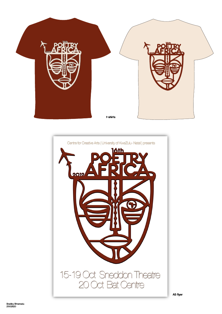
This is concept was a simple approach to the poster design. I just wanted to have a 2 colour scheme to my poster/ campaign. I had taken the design of the mask for the previous Poetry Africa poster and did a simple vector illustration of the mask. I had incorporated the title to the mask to make the poster more legible to people to read. For the other elements of the campaign i had just added the mask and used the colours differently.
Showing posts with label poetry africa. Show all posts
Tuesday, 18 September 2012
Poetry Africa Concept 1
I decided to incorporate gradients in one concept, which at the time I felt was successful. The actual concept behind the work was having the mask but having it cracked on the top of it and it shows many different aspects of what this festival is about. So by using vectors in my poster I felt that it would appeal to all target markets. On the top of the mask there was all the different aspects such as it being in Africa, poets from all over the world attending, many people coming to witness this festival and also showing that when you enter this occasion it’s a sense of being in a completely different environment were people are happy, witnessing other people doing things and celebrating the festival.
Poetry Africa
in this project we were given the task of redesigning a poster for Poetry Africa. The Poetry Africa international poetry festival takes place in Durban in early October, predominantly featuring poets from South Africa and elsewhere on the African continent. The seven-day programme includes performances, music, book-launches, the Durban SlamJam, seminars, workshops, open mic sessions, and school programs. We also need to incorporate the mask that was used in the previous posters but we can make it more modern by changing the mask all together or not using it as long as we can back it up why we decided to do this.
iJusi #27 campaign
This project was for iJusi #27 magazine and it was very challenging because we had to do design work that was not in our comfort zone. We had to create an LP cover, we could either rework on an existing LP like the Beetles or create our own. I decided to use a South African band called the Flames. Growing up as a young South African Indian boy I was hit with tons of stereotypes among the Indian community and one that reality frustrated me was when people had this perception that all Indian people listen to Bollywood music or classical Indian 1 interpretation music which is completely not true at all. So with in this project that exactly what I wanted to show that all Indian people are diverse in terms of what music we listen to. My design was using a Robertson Spice Bottle and adding all the ingredients that would go inside the bottle of psychedelic rock such as drugs, alcohol, sex and getting aids.
Subscribe to:
Posts (Atom)


