
Wednesday, 26 September 2012
Save the Rhinos Competition


The project was
given to us by the Wildlife Observation Trust. We had to do a design for a
celebrity that would be placed onto a sculpted rhino. After we had designed
this rhino we had to submit them to Lauren Laing and from there she would
contact the sportsman to give us information if we were selected. I was very
humbled for getting the chance of doing a rhino for a sportsman that is more or
less my age , I felt that I could relate to Pat Lambie because of the school
and environment we were brought up in. For me it was not about the celebrity it
was about saving rhinos. Basically I had
to redesign my concept 3 times because certain elements were missing. Pat
Lambie had a specific style that he wanted to get across for his rhino and I
managed to do this by adding the waves, which he enjoyed a lot because of his
love for surfing.
Thursday, 20 September 2012
Wolf.R

This logo was created for a client wanting a clothing label that is sporty fun and fresh to the market, but also having a sense of style and quality to it. The personality of the person i created the logo for is fierce, strong will and precious about his appearance. Due to client's brand i am not able to show the t-shirt designs but it will be available soon.
Money For Free Competition

This competition was based on the concept of how money is being used in the world. This competition is based in Macedonia. My concept was based on using a piggy bank as the bad businessman in the world as being the pigs and we are trying to get money from them.
Wednesday, 19 September 2012


Birthday Video for a friend
For this short clip i used adobe flash for the first time. I enjoyed using it because it was fun, the style of the video was very simple by using line and adding a child like song to it to make it humorous.
Tuesday, 18 September 2012

The Editorial
Illustration applied to layout


The editorial section of the brief was interesting because as an individual i enjoy magazine layout an experimenting with unusual, but clean layouts and also incorporating different illustration styles within it. For my layout i wanted a clean designers look to my layout, i wanted to create interest to the viewer and in total drawing them to my article. I used Helvetica and Thumbro for my body copy and title. I obtained my colour pallet from the illustration i did and i used the designer magazine called One Small Seed
Editorial and illustration project


For this project we had to do an illustration for an article that was handed to us by our lecturer. From these articles we had to an illustration that represented what it was about. The name of my article was the rainbow nation from black pinks to diamond chips, this article is about the generation that South Africa has been embraced with. For my illustration i decided to do something playful by doing a cut out illustration. This type of illustration is based on making the design look almost 3D by using filters on Photoshop.
Wine bottles for Neil Roake


The brief for this project was to design a wine label for a South African wine bottle. For my concept i used elements of the country in the background, i also added people to it who are locally from SA. The label is cut out in the shape of the letters S and A so that when they are on the shelf it would say SA when placed together.
Cookbook Work


annawilliams.com
For my cookbook i wanted a rustic feel to it, i wanted to set a dark mood to my design and breaking away from the norm of using simple food photography. I have gathered all my photography from a photographer called Anna Williams. I felt that i can approach this cookbook in many different ways, but this was the most successful for me to use.
Cookbook for Neil Roake


Titan Steel Furniture logo

For this logo i wanted to create a logo, that is contemporary an would show that this steel company is moving in the right direction. I decided to play with typography by paying special attention to the letters T and S, which is the name of the company. I used filters in photoshop to create a glossy look to the logo.
Poetry Africa Concept 2


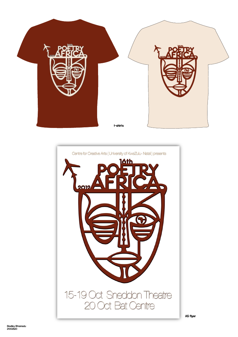
This is concept was a simple approach to the poster design. I just wanted to have a 2 colour scheme to my poster/ campaign. I had taken the design of the mask for the previous Poetry Africa poster and did a simple vector illustration of the mask. I had incorporated the title to the mask to make the poster more legible to people to read. For the other elements of the campaign i had just added the mask and used the colours differently.


Poetry Africa Concept 1

I decided to incorporate gradients in one concept, which at the time I felt was successful. The actual concept behind the work was having the mask but having it cracked on the top of it and it shows many different aspects of what this festival is about. So by using vectors in my poster I felt that it would appeal to all target markets. On the top of the mask there was all the different aspects such as it being in Africa, poets from all over the world attending, many people coming to witness this festival and also showing that when you enter this occasion it’s a sense of being in a completely different environment were people are happy, witnessing other people doing things and celebrating the festival.
Poetry Africa

in this project we were given the task of redesigning a poster for Poetry Africa. The Poetry Africa international poetry festival takes place in Durban in early October, predominantly featuring poets from South Africa and elsewhere on the African continent. The seven-day programme includes performances, music, book-launches, the Durban SlamJam, seminars, workshops, open mic sessions, and school programs. We also need to incorporate the mask that was used in the previous posters but we can make it more modern by changing the mask all together or not using it as long as we can back it up why we decided to do this.
iJusi # 27 CD items


I also created a smaller items for the second part of the project, which was to take my LP cover and turn it into a modern looking CD cover. I also made a booklet that showed the life of the Flames band members and also a poster.
iJusi Process Work


This was my entire process for the LP cover and the booklet, which took quiet a lot of effort in doing but i was proud of my end result because it looked real.
Subscribe to:
Comments (Atom)